HP Labs
Big data visualisation and navigation for a new Cloud platform (UI patent-pending)
The brief from the engineers at HP Labs was to create a cutting edge interface approach for a new Cloud Service they were developing. The main issue they had was showing how amazing the Cloud platform really was to HP business stakeholders. Its the thing about a Cloud platform - years of man-hours developing it, but too abstract to actually show of demonstrate e.g. "look at these stats on it's computational power!" and "we've nailed some really complex algorithms over the last two years, allowing the density of virtual servers to..." etc etc.
So the team decided to develop a cutting-edge interface that users would use. This is where I came in. I began a month of spending time with the engineers at HP Labs - where men in white coats work, tinkering with machines and stuff - to design something, you know, cutting edge.
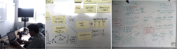 Workshop with HP engineers and Product Lead
First time I failed...I used some really great web-based patterns for the search results, user account settings, listings etc. And the team bascially said "no, no Fergus. It's OK to really push it." The working target I needed to design for was 10,000 objects within a visualisations. Which for a web-based interface is not a small about.
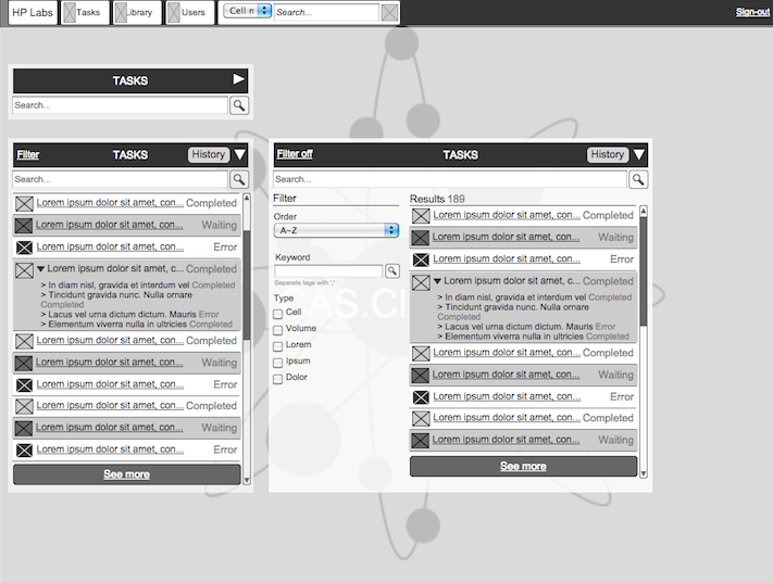 Example interface from the first round
Failure is OK. As long as you fail small, fail fast and learn from your mistakes. Lots of stakeholders I work with fear failure in their work. And rightly so. They are responsible for their organisations, bottom line, staff and so much more. However, in my approach to R&D I build in the space to fail i.e. use rapid prototyping, running multiple tests, testing early
So over the next week, I bent my mind a little out of shape to create a 'new' user interface. To really re-think those things we take for granted, like web 'pages'. Through this project, I developed a (new) string-based approach to the user interface. Its patent-pending, so I can't go into it too much. However, a fundamental flaw with the way we design for the web is to think of them as pages. (Caveat: while we are slave to the mouse and the screen interface, the most effective way to navigate predominantly text interface is up and down, just like a print page).
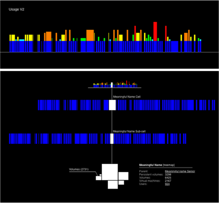 Example interface from round 2 - shaping data into strings
I got to thinking about visualising data, en masse. Thinking about it more holistically. Really with data, you are not interested in all of it. Just what's important to you. My approach was to make shapes in the data, based on what the user would be after e.g. which servers on the Cloud are going wrong. It was out of this thinking, I began to conceptualise the servers a user would be using as a string. And giving shape to that string based on the data e.g. usage, capacity etc. I like the think of it as my...Strings UI. I know, catchy eh...
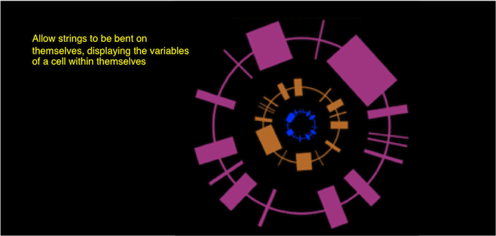 Data as bendy strings